 Theodore Brown
Psychology in Interactive Web Design
March 25, 2013 - 7 minute read
This post is based on a research paper I authored earlier this month as part of my General Psychology course at Rasmussen College.
Have you ever been struggling with a website or application that is difficult or confusing to use, and thought, “This could be so much easier if it were designed differently”? You may be surprised to discover that there are actually psychological reasons for what makes an interface good or bad, intuitive or difficult to use. This post will explore three areas of good interface design: proprioception, Gestalt psychology, and performance - with a focus on their application to web-based interactive software.
Proprioception
Proprioception refers to our body’s sense of position in space, and the position of various body parts in relation to each other. Because software is inherently non-physical, designers have to provide cues to indicate the user’s position. On traditional websites, these more often than not included breadcrumbs and navigation menus. However, in today’s world of varying device types and interaction methods (including keyboards, mice, and touch), new metaphors are necessary. One solution that is growing in popularity is to provide transitions between various screens (Bowles, 2013). By convention, leftward movement is seen as backwards, while rightward movement is seen as forwards or progression (Ibid). Vertical movement disrupts this hierarchy and can be used for actions outside the normal app flow.
There are more applications of proprioception than just transitions. For example, considering the Gestalt principle of similarity (discussed later in the essay), a button that leads to a particular section of an app could be designed and located similarly to the button that exits the section. The user would then understand that there is a connection between the two buttons, with the result that they would more intuitively understand how to navigate within the app. By carefully thinking about the logical location for data and controls within an app, and supplying cues to the user to indicate their position, developers can create an experience that requires less learning and feels much more natural to use.
Gestalt Principles
Gestalt is a German word meaning “shape” or “form,” and it refers to the way visual input is perceived by the human mind (Bradley, 2010). Gestalt psychologists have proposed a number of organizational laws (called Gestalt principles) which “specify how people perceive form” (Huffman, 2009, p. 105). The following section will examine five of these principles: Figure and Ground, Similarity, Proximity, Uniform Connectedness, and Parallelism, and how each of them applies to interactive software design.
Figure and Ground refers to the way humans perceive elements as either figure (the object of focus) or ground (the background which contains or supports the figure). When two objects overlap, the smaller object is seen as the figure against the larger background (Bradley, 2010). When designing web applications, it is important to ensure that there is sufficient padding around figures in the interface, and sufficient contrast between the figure and ground – this will allow elements to stand out and make the layout easier to understand at a glance. Consider the following example: the left-hand button’s lack of color, padding, and contrast makes it more difficult to understand at a glance than the button on the right.

The Gestalt principle of Similarity states that objects with a similar appearance will be perceived by humans as related (Bradley, 2010). Similarity can be achieved through shape, color, size, location, and other properties. In interface design, this principle is useful for helping the user to understand which elements are related or part of a group. Designers must be careful, however, to avoid similarity when elements are not related, as users will otherwise perceive an unintended association and find the application more confusing to use.
A third Gestalt principle is Proximity. According to this law of organization, “things that are close to one another are perceived to be more related than things that are spaced farther apart” (Rutledge, 2009). This principle is simple yet powerful, and takes precedence over similarity (Ibid). One practical use of this law in an interface might be a multi-column layout, where each column is separated by empty space and contains a unified collection of related elements or data. If there is not enough space between separate elements, however, it will be more difficult for users to determine that they are unrelated.

According to the principle of Uniform connectedness, elements that are visually connected are perceived as related (Bradley, 2010). As a simple example, consider a speech bubble that is connected to a cartoon character by an arrow. Uniform connectedness trumps both visual similarity and proximity when determining related elements. As with the principle of similarity, this is an important tool for interface designers, but care must be taken that there are not unintended connections between separate parts of an interface (whether because of lines, colors, or other connecting elements). As a personal example, when I was recently planning the interface design for a web app, I considered using the same background color for the headings of two separate sections in the interface. However, I was never satisfied with how it looked. After studying the Gestalt principles, I realized that using the same color visually connected the two headings, causing a perception that they were related when they actually were not. This discovery prompted me to rethink my approach to the interface.
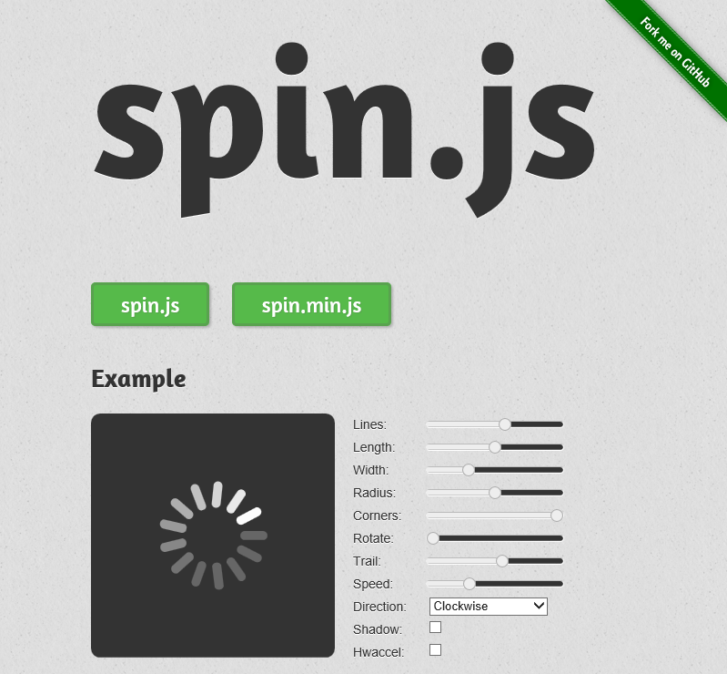
The last Gestalt principle I will examine is Parallelism, which states that parallel elements are perceived as more related than non-parallel elements (Bradley, 2010). A practical application of this to UI design could be rotating a less-related element so that its contents are at a different angle to the rest of the interface (consider the screenshot below, where the “Fork me on GitHub” ribbon is angled away from the rest of the content).
Performance
No matter how good an application’s layout, visual design, and navigation, it still won’t provide a good user experience if it performs poorly. Users expect animations to be smooth, and apps to respond immediately to their taps, clicks, and gestures. User perceptions of time often don’t match reality, however, and for developers this perception is critical. The more steps remembered in a process, the slower it seems (Tepper, 2012). Therefore, reducing the number of steps required to complete an action will make an app “feel” faster, even if the amount of time involved does not significantly change.
Research has shown that actions must take no longer than 50-100 milliseconds to feel instant (Tepper, 2012). Using an online latency demo (which at the time of this writing appears to no longer be available), I found that I personally started noticing a lack of responsiveness after about 75ms. Interestingly, users have a much higher tolerance for delays when there is an indication of progress, so if an action could take longer than 100ms it may be a good idea to give the user some type of feedback (for example, via an animated progress bar or other indicator).
On the Web, optimizing performance and providing feedback can be even more important than in native apps, for three reasons:
- Web-based applications will be accessed by a much wider variety of device types and performance classes.
- Non-optimized apps can increase bandwidth costs, especially when scaling to thousands or millions of users.
- Actions by one user can directly impact the performance of other users on the same server.
Understanding what makes a good interface and usable application is critical to creating the best user experience. Applying the principles of proprioception, Gestalt psychology, and performance optimization/feedback will enhance usability and create an environment that users will love to use and tell their friends about.
References
Bowles, C. (2013, March 7). Better Navigation Through Proprioception. Retrieved from A List Apart: https://alistapart.com/column/better-navigation-through-proprioception/
Bradley, S. (2010, January 25). Gestalt Principles: How Are Your Designs Perceived? Retrieved from Vanseo Design: https://vanseodesign.com/web-design/gestalt-principles-of-perception/
Huffman, K. (2009). Psychology in Action (8th ed.). Hoboken, NJ: John Wiley & Sons, Inc.
Rutledge, A. (2009, March 28). Proximity, Uniform Connectedness, and Good Continuation. Retrieved from https://www.andyrutledge.com/gestalt-principles-3.html
Tepper, D. (2012, April 3). How to improve performance in your Metro style app. Retrieved from Windows 8 app developer blog: http://blogs.msdn.com/b/windowsappdev/archive/2012/04/03/how-to-improve-performance-in-your-metro-style-app.aspx